Crash Data Visualization Using Leaflet
Ashirwad Barnwal | ISU Graphics Group | 2020-09-03 (updated: 2020-09-19)
1 / 34
Who am I?
No one cared who I was until I put on the mask. 😉
Brief background:
- 3rd year PhD student in Civil Engineering (Transportation Data Analytics)
- 2nd year MS student in Statistics (concurrent degree)
- I took Stat 579 (Intro to R) with Dr. Hofmann in Fall 2018
Connect with me at:

Added mask to my photo using Kapwing 😄
2 / 34
What's the goal of this presentation?
Start here:

(Available at [http://gph.is/1bbZpie](http://gph.is/1bbZpie), Sep 02, 2020)
End here:

(Available at [http://gph.is/2alF2tv](http://gph.is/2alF2tv), Sep 02, 2020)
3 / 34
Enough of humor...
Let's get started with some serious data visualization!

(Available at [http://gph.is/1qKXewI](http://gph.is/1qKXewI), Sep 02, 2020)
4 / 34
What is Leaflet?
5 / 34
Leaflet for R
6 / 34
What open data am I using?
7 / 34
Some notes about the data processing
- Step 1: Downloaded crash data from the open data portal. The data has records of all crashes that occurred within Iowa over the last 10 years.
- Step 2: Processed data and extracted 5 years (2015--2019) worth of fatal crashes
Here's a glimpse of the extracted data set:
8 / 34
Map with circles
Note: Unless stated otherwise, this and subsequent data visualizations uses 2019 fatal crash data to improve leaflet rendering performance.
9 / 34
Map with circles and a minimap
10 / 34
Map with marker clusters
11 / 34
Map with a heatmap layer
12 / 34
Map with a hexbin-based heatmap layer
13 / 34
Map with layers control
14 / 34
Map with base and overlay layers control
15 / 34
Map with synced heatmap layers
Summer (L) vs. Winter (R) fatal crashes




16 / 34
Map with desynced heatmap layers
Same heatmap on both left & right panes


17 / 34
Map with a choropleth layer
18 / 34
Map with a choropleth layer (normalized)
VMT: Vehicle Miles Traveled; Crash rate: Number of crashes per million VMT
19 / 34
Map with side-by-side choropleth layers
20 / 34
Map with mini circle charts
21 / 34
Map with mini pie charts
22 / 34
Map with mini bar charts
23 / 34
Animated map with mini circle charts
24 / 34
Animated map with mini pie charts
Weekday (purple) vs. Weekend (orange) fatal crashes
25 / 34
Animated map with side-by-side mini circle charts
Same mini circle charts on both panes
26 / 34
Animated map with side-by-side circle & pie minicharts
27 / 34
Life outside R & Leaflet...
28 / 34
Kepler.gl
29 / 34
Deck.gl
30 / 34
Datawrapper
31 / 34
QGIS
32 / 34
ArcGIS Online
33 / 34
Thank you. Stay safe, healthy, & responsible!
Labor day, s/he is 👀 at you!
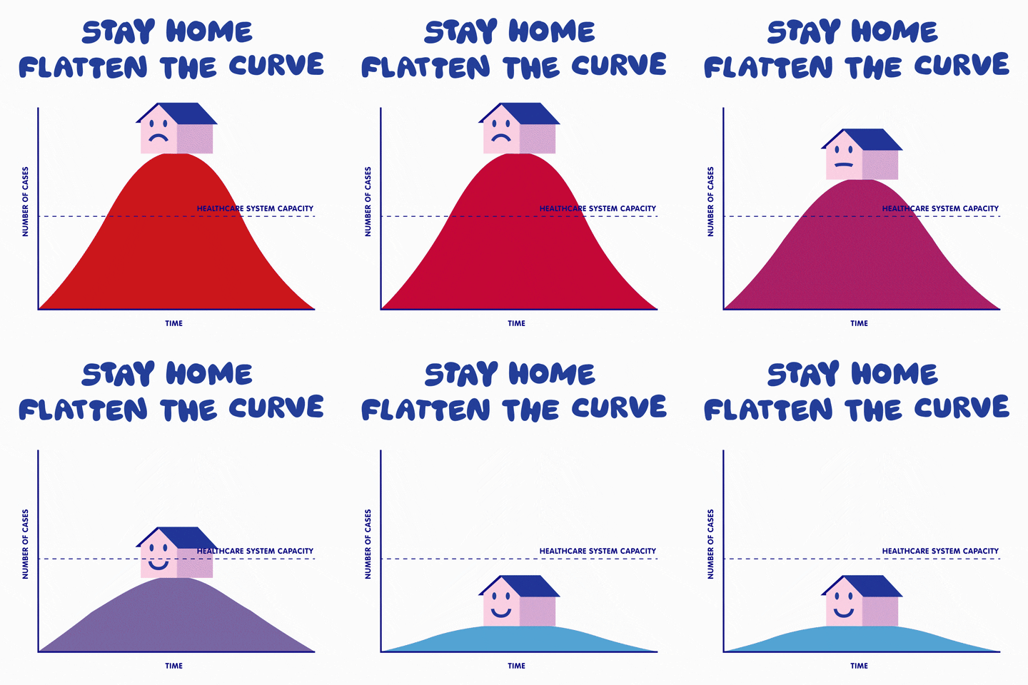
(Available at [https://gph.is/g/Z7gwmOm](https://gph.is/g/Z7gwmOm), Sep 03, 2020)
Acknowledgements
- Yihui Xie for his
xaringanpackage - Harry Zhu for his awesome leaflet ideas on his GitHub repo
- Ganesh Krishnan & ISU Graphics Group for inviting me to give this talk
Closing remarks...
- Check out the GitHub repo that powers these slides
- License: CC BY-SA 4.0
34 / 34